15 STEPS TO DESIGN AN ONLINE STORE
15 STEPS TO DESIGN AN ONLINE STORE
Discover my approach to the design process, based on 15 steps I took to create a beautiful and intuitive design.
Discover my approach to the design process, based on 15 steps I took to create a beautiful and intuitive design.
Overview
Demo design of an online jewelry store. It shows important stages and elements necessary to implement the project. It has not been implemented, but I believe it will help to present my way of thinking. As a designer and former owner of a jewelry brand, I know what elements an online store should consist of. I also understand how important it is to ensure the usability. I follow the “less is more” principle and I value simplicity, which is why the website consists of a minimum number of elements and focuses on the main goals.
Problem
Need a small jewelry brand and an online store to sell its products. Unfortunately, this was limited by budget and time.
Solution
Solid research and planning
Simplification
Features limited to the minimum
My Role & Responsibilities
Product Designer: Collecting requirements, Research, UX Design, UI Design
Team
The Case Study presents only design process prepared by one Product Designer (myself).
Planning
Planning
I decided to determine the main features of an online store. The goal of an online store is to sell. It is important to guide the client through the purchase process. Relevant information, like color options, a size guide, product details (dimentions, weight, lifestyle photos), shipping and returns details, contact details for support or payment method, has to be visible and easy to find. The process should be nice and seamless.

Research
Research
First, I did some research. Reviewing existing products allowed me to verify and supplement the initial list of features and gather visual inspiration.
Limitations
LIMITATIONS
A small brand often has limited resources. The design should be tailored to the business. An online store must be useful and reliable. The less, the better for all parties, both for the customer, developer and online store staff. Easy and quick implementation and no technical problems reduce costs, which are one of the limited resources of a small brand.
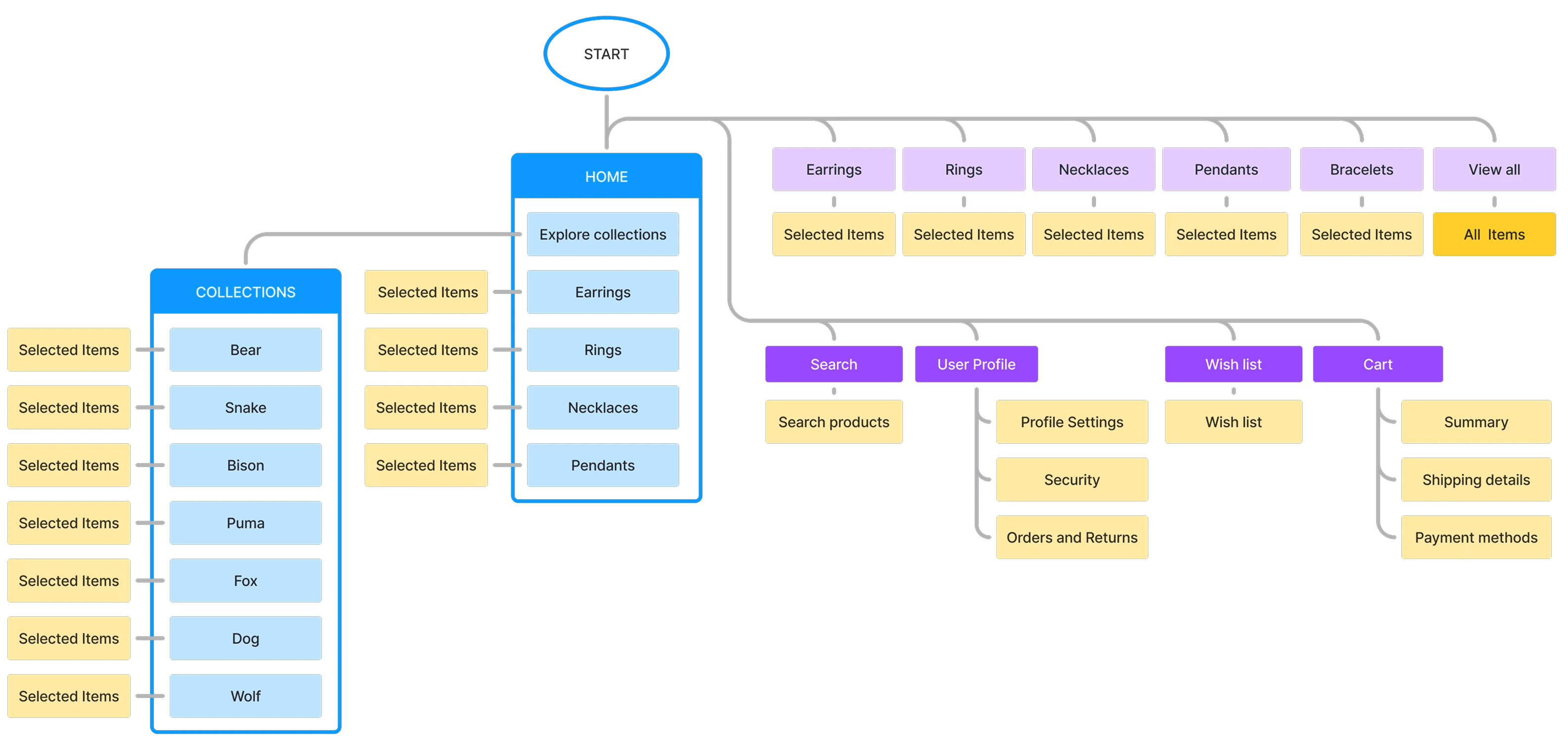
Sitemap
Sitemap
A sitemap allows presenting the structure of a website and understand the connections between subpages. It’s helpful both during the designing and implementation.
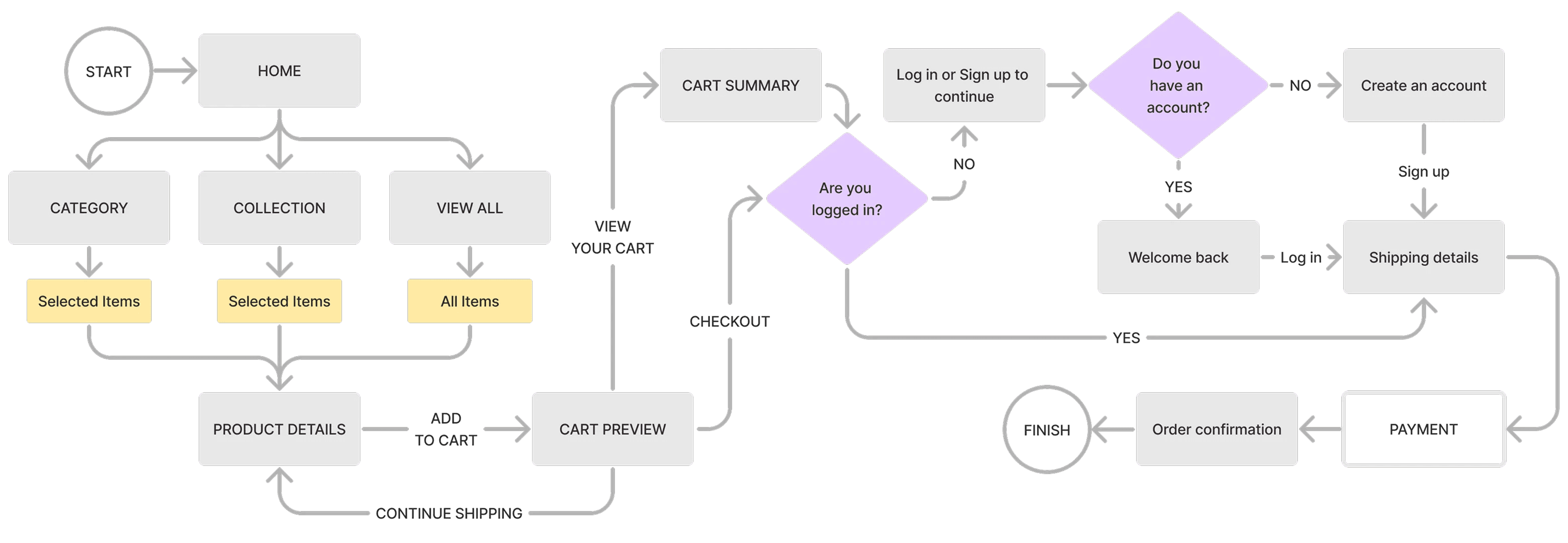
User flow
User flow
The purchase user flow begins at the home page, leads through an overview of products and the possibility of selection by type or category. To make a purchase, the customer has to log in or register. Completing the order requires going through the order summary and providing delivery and payment details. It ends with an order confirmation.
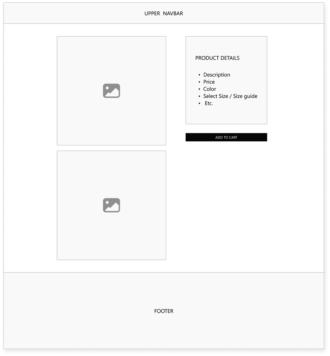
Wireframes
Wireframes
Before work on the visual side of the website begins, before photos, fonts are selected and buttons are designed, I usually create li-fi models that help determine the structure of individual subpages and highlight the most important elements.

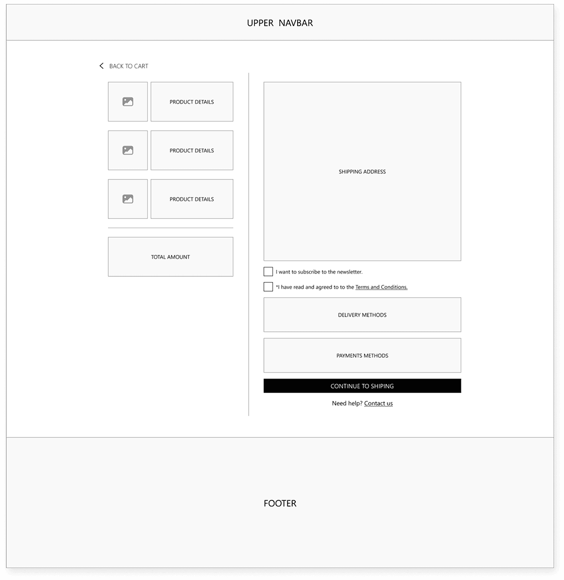
RWD
RWD
When creating a mockups, I take RWD into account, which makes the website user-friendly on various devices. I follow the Mobile First principle because, as research shows, users will in most cases make purchases using mobile devices.

Consistency
Consistency
The design should be consistent, prepared color palette and chosen group of fonts is something that we should stick to when designing.
Components
Creating a component library helps maintain design consistency. It is expanded as needed. However, I try to limit the number of elements to the minimum and use ready-made components or modify them if necessary. Working on a project prepared in this way allows for quick changes and efficient product development. A well-prepared library or Design System will allow maintaining the consistency of the project, even when new people are joining the project or the original designers are no longer involved in it.


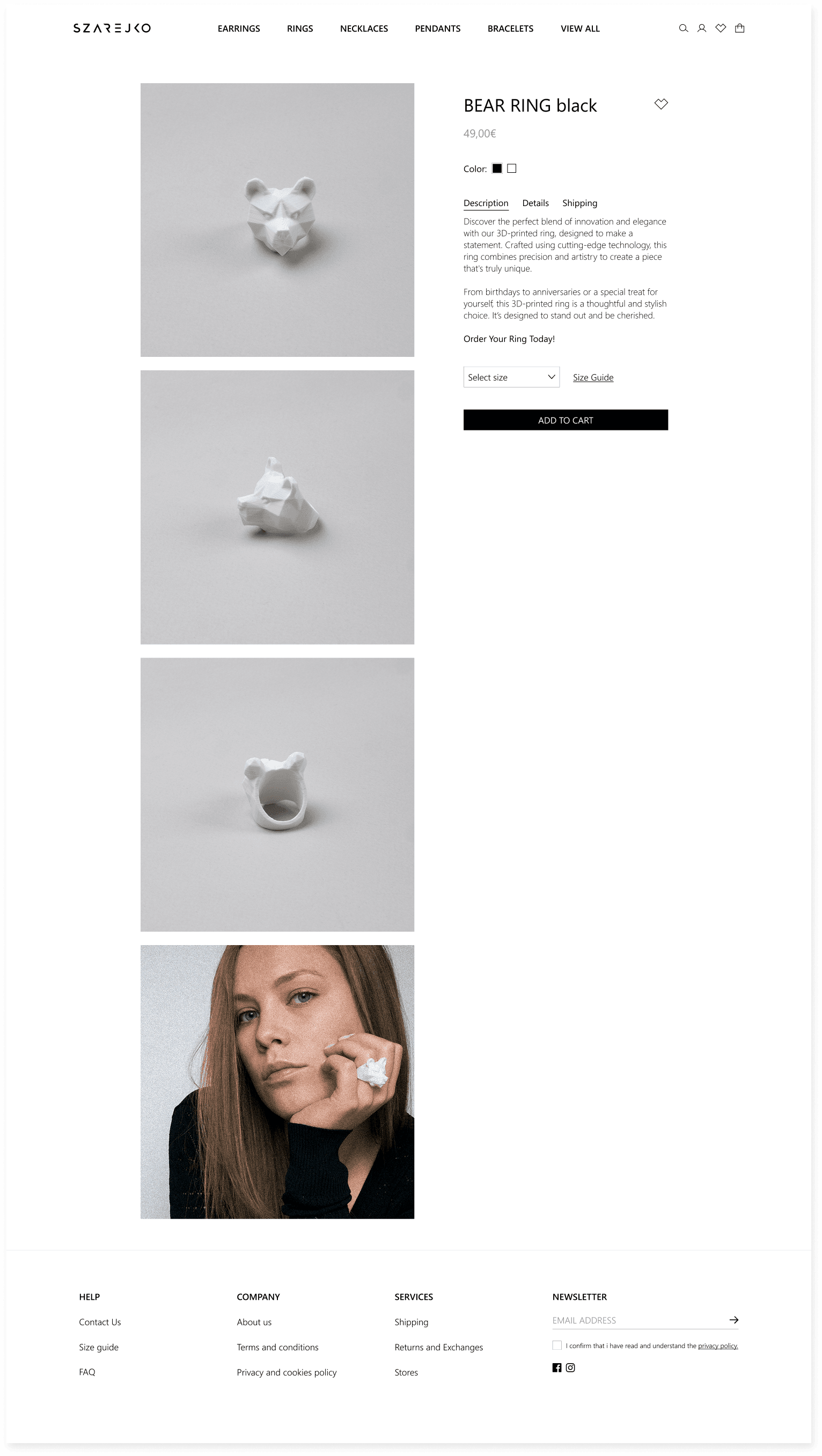
UI Design
UI Design
When the website structure is ready, I start taking care of its visual side. Based on previously prepared Wireframes, I fill the pages with components, photos and other elements. If any modifications are needed to the wireframes, I also make them at this stage.

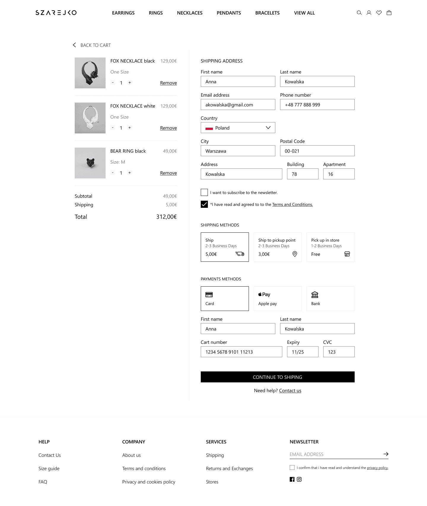
Errors
Errors
Making purchases via the online store requires providing contact details and the address of the recipient. Missing or incorrect information can make the order impossible to process. To minimize the number of problems associated with this situation, we inform the user about the required text fields and consents.
UNFILLED
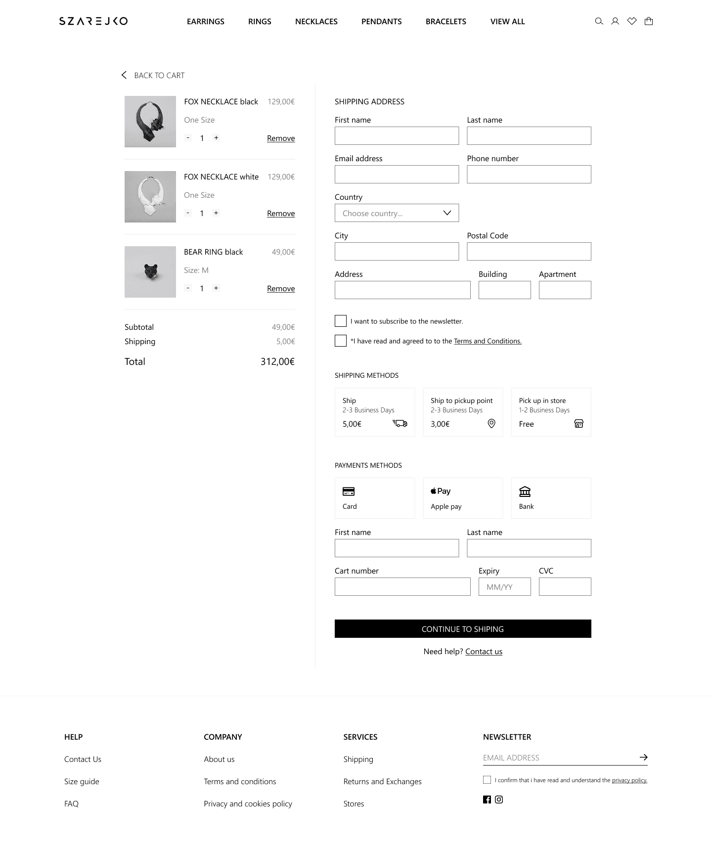
ERROR

FILLED
Home Page
Home Page
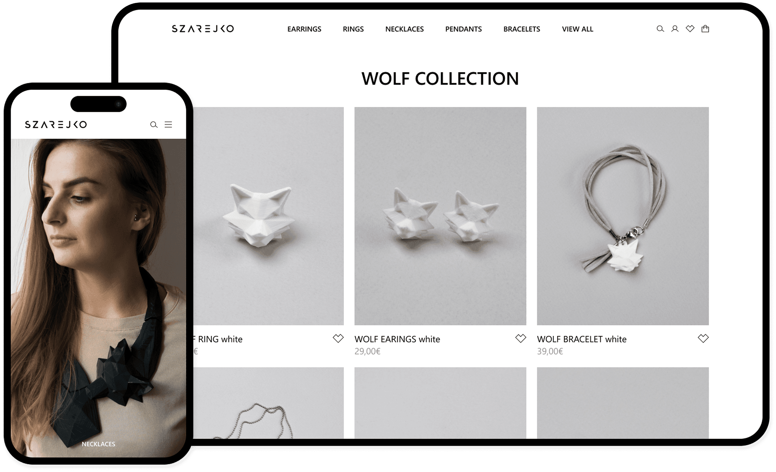
Components are the basis for building the most repeatable parts of the website. Some subpages require supplementing with custom elements, which may appear only once on the entire page. An example is the home page, which, regardless of the other subpages, may change depending on the season or current trends. The home page has a slightly different function than the other subpages. It is the brand's showcase and I wanted it to represent its character, reaching the hearts of customers with its style and photos. The navigation at the top of the page prevents you from getting lost and ensures proper navigation and functionality of the page.


Variants
Variants
Obtaining the right effect is preceded by creating various solutions and choosing the right one. Meeting both functional and visual requirements. The Double Diamond model can be used to illustrate this process. We start with various concepts and their development, moving on to the stage of elimination, selection and refinement of the right solution. Sometimes I choose several solutions and consult on the choice, relying on the subjective opinion of someone from the team, a person not related to the project or, during usability testing. In the last case, I want to check the usability and correctness of the design assumptions. Visual issues are usually refined among team members. In this case, one of the variants uses components and refers to one of the subpage types, while the other refers to a custom product page. Ultimately, I decided to choose a version on a right-hand side.


Admin Panel Sitemap
Admin Panel Sitemap

Backoffice
Backoffice
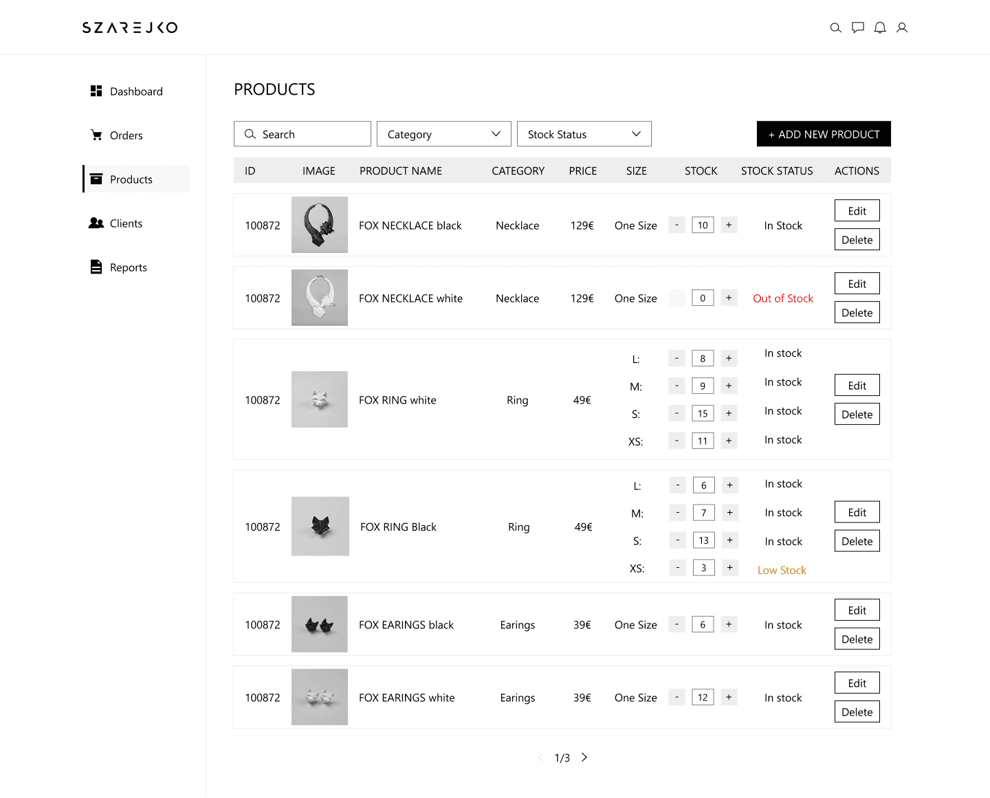
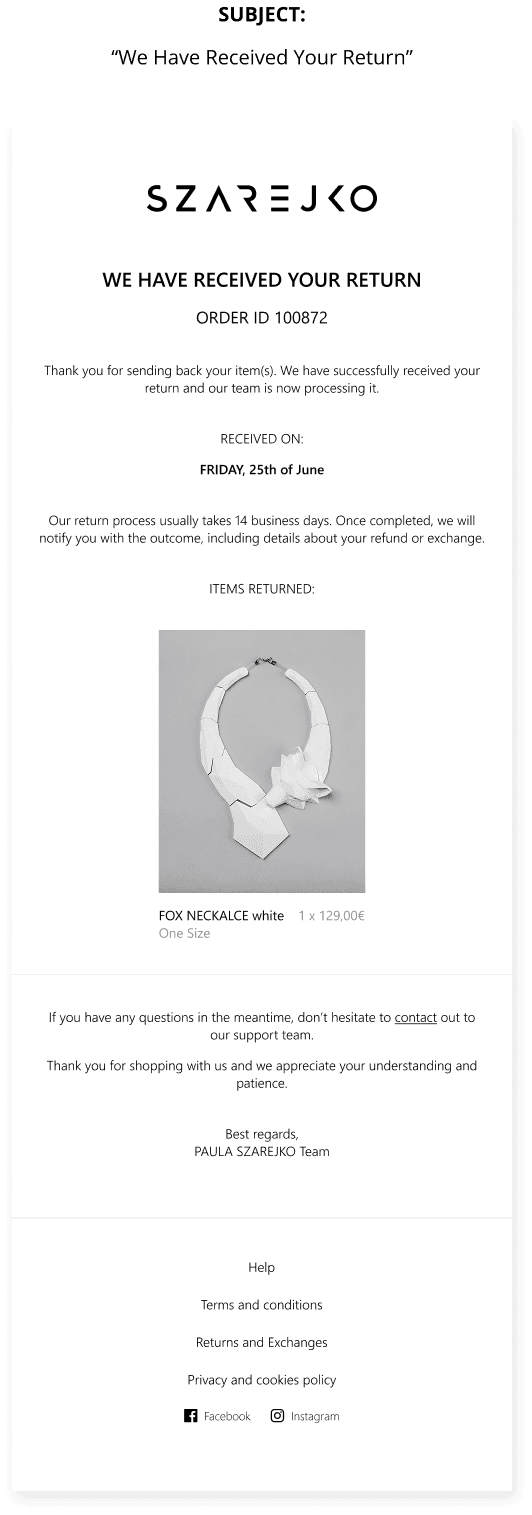
The online store is a product not only for the brand’s customers. On the other side of what the customer sees, there is a number of functionalities enabling store and order management. Properly prepared, it allows to automatically send notifications about the status of the order. The customer receives messages containing details such as order number, summary, package number and tracking redirection.
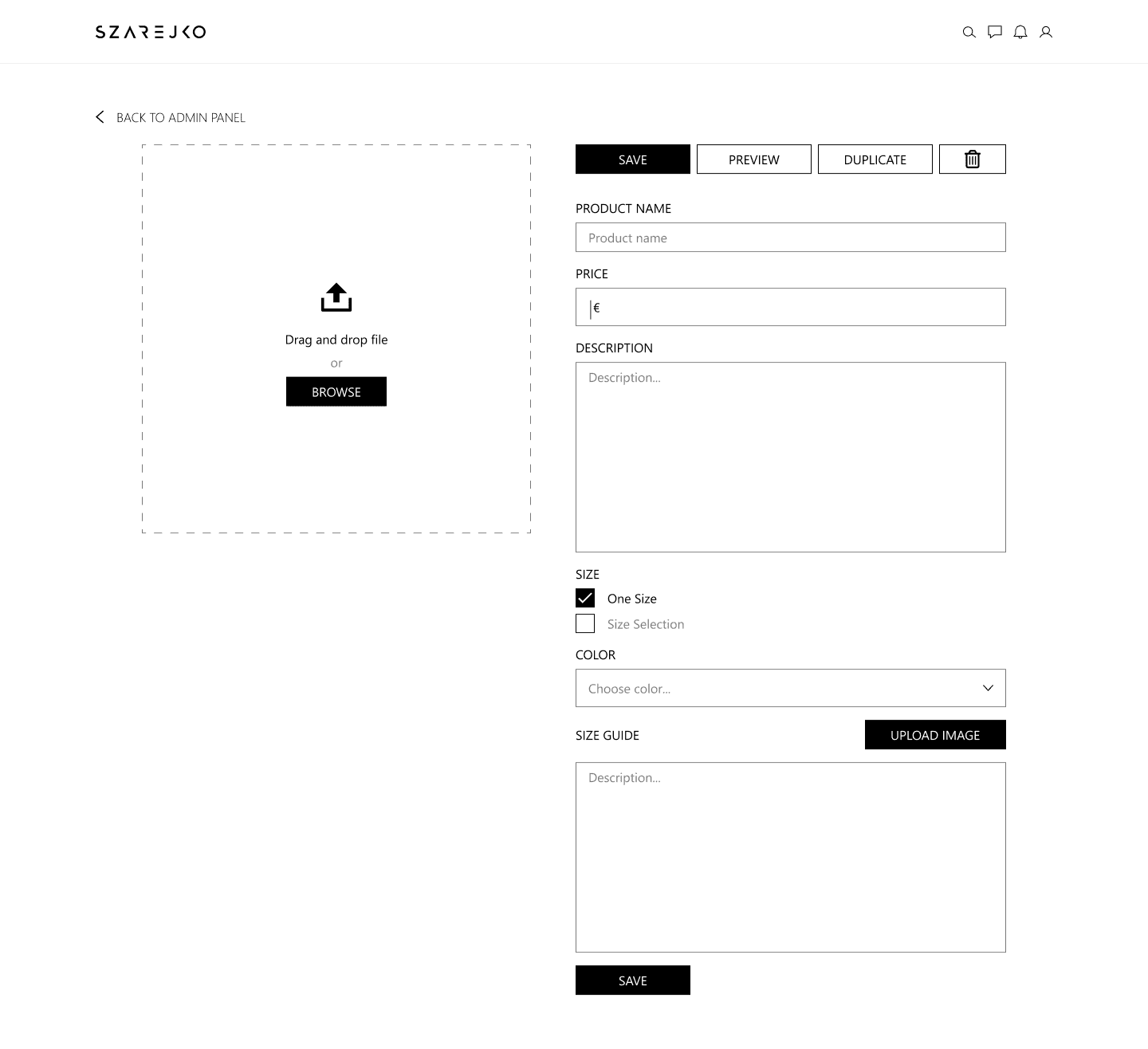
Stock status also need to be managed and replenished accordingly. Product unavailability should be visible on the website. When a product is back in stock, users who have signed up for the waiting list are automatically notified.
DASHBOARD

ORDER

PRODUCTS
ADD PRODUCTS
CLIENTS
REPORTS
MAILING
Mailing
The user is informed by e-mail about stages of order process, return, failure to receive payment or re-availability of the product, through automated notifications. Users who have signed up for the newsletter receive marketing materials by e-mail, and information about special offers reaches them first, allowing them to make purchases before other users. Mailings can be personalized and adapted based on previous orders, or be a regular advertising.

Conclusions
CONCLUSIONS
When designing, there’s a need to maintain a balance between user needs, business goals, technical constraints, and additionally stick to budget and time limits. This is not an easy task and certainly does not allow for unlimited creativity. The scope and process should be adapted to the project. UX designers are advocates of users, but ultimately the designed product must provide the company with revenue that will hopefully allow continuing product development process.
Planning
I decided to determine the main features of an online store. The goal of an online store is to sell. It is important to guide the client through the purchase process. Relevant information, like color options, a size guide, product details (dimentions, weight, lifestyle photos), shipping and returns details, contact details for support or payment method, has to be visible and easy to find. The process should be nice and seamless.
Research
First, I did some research. Reviewing existing products allowed me to verify and supplement the initial list of features and gather visual inspiration.
Limitations
A small brand often has limited resources. The design should be tailored to the business. An online store must be useful and reliable. The less, the better for all parties, both for the customer, developer and online store staff. Easy and quick implementation and no technical problems reduce costs, which are one of the limited resources of a small brand.
Sitemap
A sitemap allows presenting the structure of a website and understand the connections between subpages. It’s helpful both during the designing and implementation.
User flow
The purchase user flow begins at the home page, leads through an overview of products and the possibility of selection by type or category. To make a purchase, the customer has to log in or register. Completing the order requires going through the order summary and providing delivery and payment details. It ends with an order confirmation.
Wireframes
Before work on the visual side of the website begins, before photos, fonts are selected and buttons are designed, I usually create li-fi models that help determine the structure of individual subpages and highlight the most important elements.
RWD
When creating a mockups, I take RWD into account, which makes the website user-friendly on various devices. I follow the Mobile First principle because, as research shows, users will in most cases make purchases using mobile devices.
Consistency
The design should be consistent, prepared color palette and chosen group of fonts is something that we should stick to when designing.
UI Design
When the website structure is ready, I start taking care of its visual side. Based on previously prepared Wireframes, I fill the pages with components, photos and other elements. If any modifications are needed to the wireframes, I also make them at this stage.
Errors
Making purchases via the online store requires providing contact details and the address of the recipient. Missing or incorrect information can make the order impossible to process. To minimize the number of problems associated with this situation, we inform the user about the required text fields and consents.
UNFILLED
ERROR
FILLED
Home Page
Components are the basis for building the most repeatable parts of the website. Some subpages require supplementing with custom elements, which may appear only once on the entire page. An example is the home page, which, regardless of the other subpages, may change depending on the season or current trends. The home page has a slightly different function than the other subpages. It is the brand's showcase and I wanted it to represent its character, reaching the hearts of customers with its style and photos. The navigation at the top of the page prevents you from getting lost and ensures proper navigation and functionality of the page.
Variants
Obtaining the right effect is preceded by creating various solutions and choosing the right one. Meeting both functional and visual requirements. The Double Diamond model can be used to illustrate this process. We start with various concepts and their development, moving on to the stage of elimination, selection and refinement of the right solution. Sometimes I choose several solutions and consult on the choice, relying on the subjective opinion of someone from the team, a person not related to the project or, during usability testing. In the last case, I want to check the usability and correctness of the design assumptions. Visual issues are usually refined among team members. In this case, one of the variants uses components and refers to one of the subpage types, while the other refers to a custom product page. Ultimately, I decided to choose a version on a right-hand side.
Admin Panel Sitemap
Backoffice
The online store is a product not only for the brand’s customers. On the other side of what the customer sees, there is a number of functionalities enabling store and order management. Properly prepared, it allows to automatically send notifications about the status of the order. The customer receives messages containing details such as order number, summary, package number and tracking redirection.
Stock status also need to be managed and replenished accordingly. Product unavailability should be visible on the website. When a product is back in stock, users who have signed up for the waiting list are automatically notified.
DASHBOARD
ORDER
PRODUCTS
ADD PRODUCTS
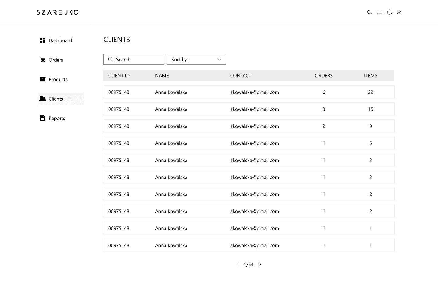
CLIENTS
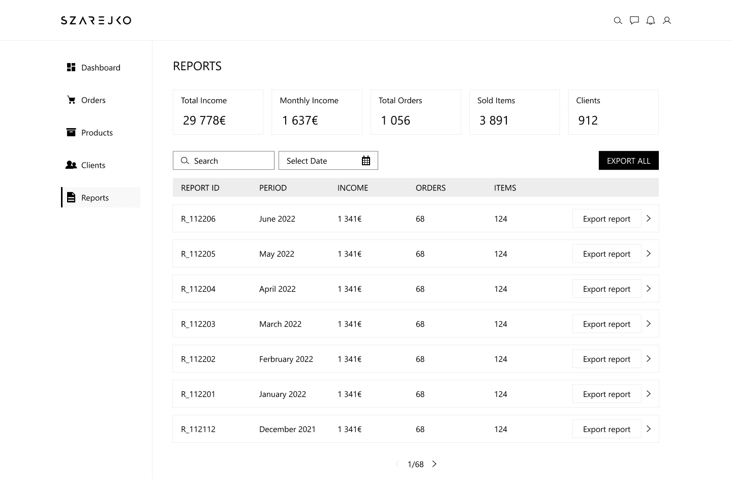
REPORTS
MAILING
The user is informed by e-mail about stages of order process, return, failure to receive payment or re-availability of the product, through automated notifications. Users who have signed up for the newsletter receive marketing materials by e-mail, and information about special offers reaches them first, allowing them to make purchases before other users. Mailings can be personalized and adapted based on previous orders, or be a regular advertising.

Conclusions
When designing, there’s a need to maintain a balance between user needs, business goals, technical constraints, and additionally stick to budget and time limits. This is not an easy task and certainly does not allow for unlimited creativity. The scope and process should be adapted to the project. UX designers are advocates of users, but ultimately the designed product must provide the company with revenue that will hopefully allow continuing product development process.